 While there are all kinds of strategies for maximizing your social media brand, this Infographic from Tailwind offers ten targeted ways to optimize your virtual presence. How many of these are you using?
infographic
The Promise of Learning Analytics [INFOGRAPHIC]

More and more students are working with digital learning material. The data that’s being generated by student interaction with this material is the fuel for the Learning Analytics engine. Analyses of this data can help to create a clearer picture of the progress a student is making, the level he or she is working on, and the way students prefer to learn. Kennisnet’s The Promise of Learning Analytics Infographic you will review the road to more differentiated and personalized education. Want more? Check out 5 Reasons Why Learning Analytics are Important for eLearning, that highlights some of the most significant arguments for why Learning analytics have the power to improve eLearning in education and training.
Coaching Teachers [INFOGRAPHIC]

“Am I a good coach or am I an effective coach?” One area Kristin Houser going to work on is the quality of my feedback. In this infographic she identifies 4 ways to focus on improving your coaching game in 4 weeks’ time. What area do you struggle with or would like to improve in your own coaching practice? These ideas can help.
Meet the Modern Learner [INFOGRAPHIC]
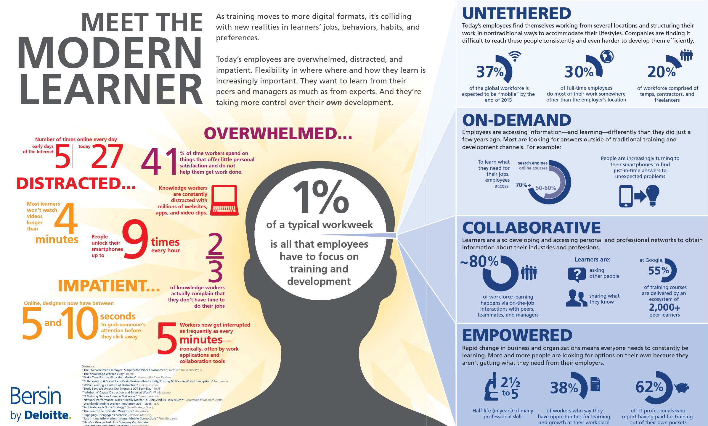
In this infographic, Bersin makes the case that learners today of all ages are very complex knowledge brokers who define and pursue their own learning through unique, personal learning modalities. The data presented makes a compelling case for instructional design and delivery implications for educators. How effectively is your district or institution accommodating these quickly shifting learner characteristics?
Technology Defines Higher Ed’s New Normal [INFOGRAPHIC]

This new infographic from Flat World Education illustrates how technology has helped foster growth in the education world, and has also increased the workload. The data also shows that 45 percent of today’s students will take at least one online course, whereas learning in the 1980s was confined to classrooms. Also, two two out of three college students today use a smartphone for school work — a capability that didn’t exist even 10 years ago, let alone 30.
View original post here.
Encouraging a Team Working Environment [INFOGRAPHIC]

Here are 27 ways to put an end to the Red Pen mentality in education. What is Red Pen mentality? It is one of those people always walking around pointing out the flaws and never having a solution. Often in education, and in other team work environments, team members are quick to criticize. Team members either prefer their way or are insecure about their way. The easiest response is to point out the flaws of others, to gossip, or engage in other destructive behavior. This breaks down the team and destroys the cooperative environment. Mia MacMeekin offers this infographic on how to foster a positive team working environment.
26 Effective Ways to use Twitter for Educators [INFOGRAPHIC]
 Teachers and educators in the present fast-paced, ever evolving world of communication are presented with a plethora of options which might sometimes be overwhelming. To reduce the efforts of teachers in learning a new form of communication, we give you some of the most effective ways of using the most modern form of communication, Twitter. The 26 Effective Ways to use Twitter for Teachers and Educators Infographic is aimed at educators interested in utilizing Twitter as a communication and collaborative tool, for educators who like telling a story and effectively reaching out to an audience who they normally can’t! Check out the 26 effective ways to do that.
Using Gamification to Engage Your Audience [INFOGRAPHIC]
 Did you know that 70% of Forbes’ Global 2000 have plans to use Gamification? Gamification has quickly become a super trend in marketing, customer engagement and employee retention. Demand Metric has created this new infographic to share what gamification is, how it works, facts, stats, benefits, and how to get started. View the original posting here.
The Periodic Table of Wearable Technology [INFOGRAPHIC]

Click to enlarge
APX Labs, which sells Skylight — software that connects wearable tech to enterprises — is out with a smart “periodic table” of the enterprise wearable ecosystem. It’s worth looking at because it gets so much right. The chart’s focus is not on hardware or software, although those layers are certainly represented. Instead, it breaks down enterprise needs by function. Categories on the edges — communications on the left, and “work and help” on the right — are about “doing your work,” Ed English, APX’s chief product officer told WTI. “If the left-hand column is about connecting to people, the right-hand column is about connecting to work, getting your help and getting instructions.”
Comparing Blended and Flipped Learning [INFOGRAPHIC]
 This infographic, from the Innovative Learning Institute, offers an excellent analysis of the value blended learning can bring to a classroom, as well as why every flipped classroom is a blended learning environment, but every blended learning environment isn’t necessarily a flipped classroom. Be sure to click the infographic for the full version.
